
"GBA Studios" First Official Website
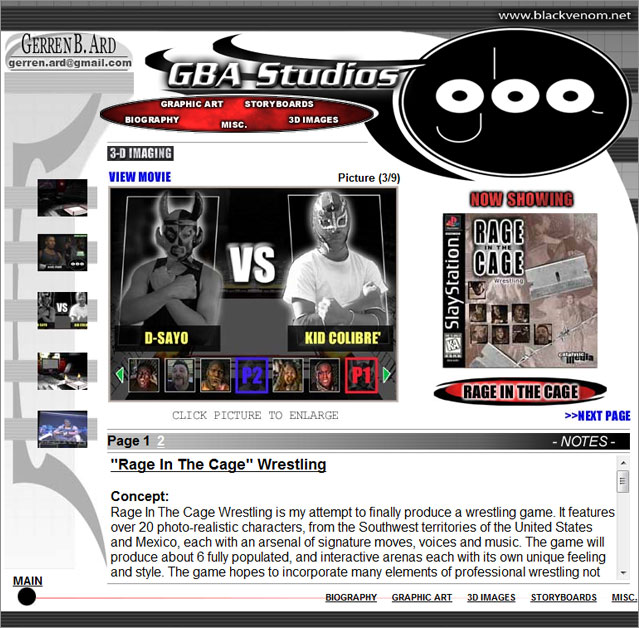
Above, is the first GBA Studios site that many remember. It was created in 2005 and placed online in 2006. It served as the official design until 2013.
The design was ahead of its time when first introduced, however, the years later would introduce higher resolutions that quickly made the site smaller in size. Photo compression methods improved as well, allowing more information to be placed online and less memory required to load. As a result, the former website is more than twice the size of the current website, yet, held about the same amount of files.
The following websites/website-designs were created through the years:
"GBA Studios" Second Official Website
 |
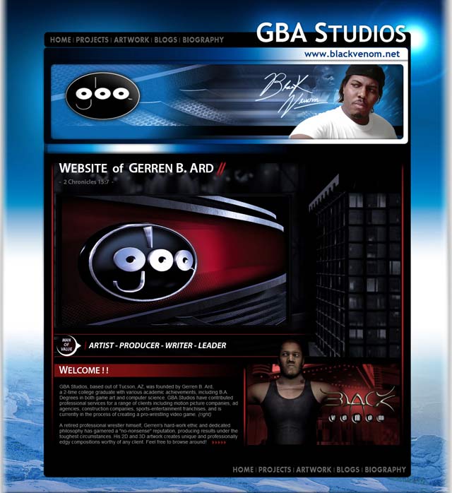
(above) The new design the official "GBA Studios" website (2014)
This website design is my favorite yet and it's quite pleasant to the eyes.
I made some big changes this time around.
The most noticeable change may be seeing my face incorporated into the core of the site, which is a sad, but true, story in itself. In my past website, outside of my 3D "Black Venom" model, there was only 1 picture of me, and you had to dig a little ways to get to it. The reason for this, is what makes it a sad story. Some people were actually hesitant to contract a Black individual for work. On more than one occasion, I have been denied jobs just because of this. I have actually conducted phone interviews, where they would believe I was "someone else," and the job was as good as mine. When they saw me in person, they would retract the offer.
This time around, in this socially insensitive climate, I'm not playing "that" game anymore.
It was "2 Chronicles 15:7" that gave me a second wind. I was reflecting on the goals I laid ahead of me, and more often than not, I felt I was doing it all for naught. One day, as I was packing boxes, I grabbed my Bible to place it in safer spot and thumbed through its pages quickly. I fixed my eyes on a random verse:
"Be ye strong therefore, and let not your hands be weak: for your work shall be rewarded."
My jaw dropped. I realized that verse was meant specifically for me to see at THAT very moment! ALL the pages in that book, ALL the verses, ALL the stories.. and I got the one verse that said EVERYTHING I needed to hear. Believe me when I tell you, God spoke to me that day. He spoke to ME that day! If you don't know Him, PLEASE, get to know Him. People will let you down constantly, but He will not let you fall as long as you call on Him. There is a joy and a peace with Him that's unexplainable.
That's why I chose to share Him on my page.
|
"GBA Studios" Website (Coming Soon)
 |
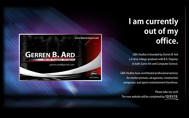
(above) The "GBA Studios" website placeholder (Oct. 2013) announcing the new 2014 website.
|
"Blocked" Website
 |
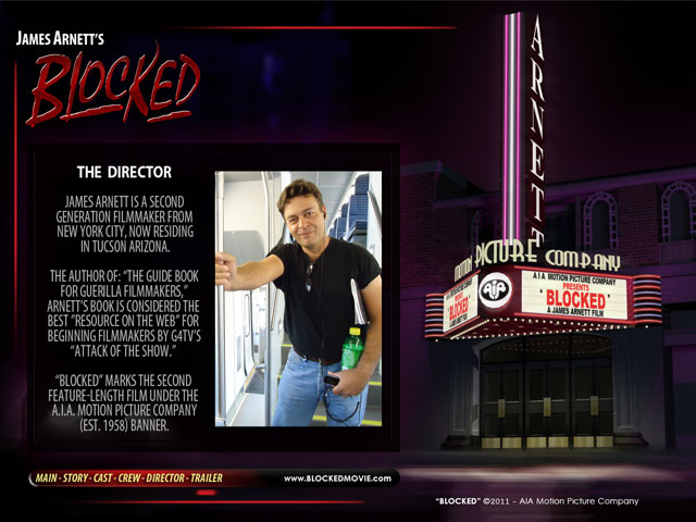
(above) The concept design for the "Blocked" movie website (2011)
This website is one of my favorites. It was the first one coded in HTML5, and took advantage of the new technology. This site animated in a way most people are not familiar with online. It really pushed the boundary of imagination to a whole new level. I'm proud my buddy, Travis, was able to code it like I imagined. It was a test for everyone, and it worked quite well. Pushing the envelope is something I enjoy doing! You have to visit this site to see exactly what I mean! : )
|
"Talk-Easy" Fake Website
 |
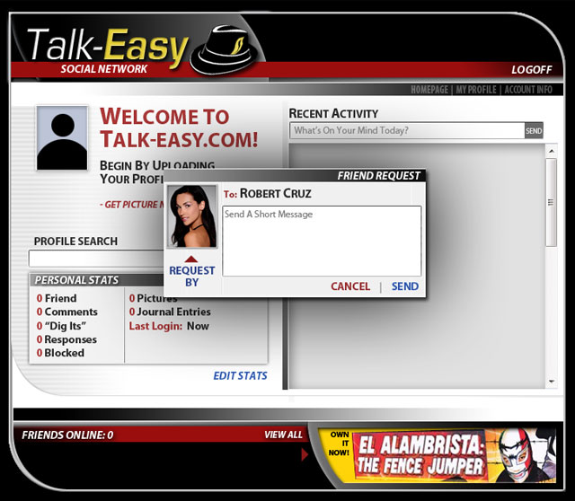
(above) The "Talk-Easy" Website used in the movie "Blocked" (2011)
The "website" itself was simply a shell, animated to look like a functioning website. In fact, many of the same procedures and processes used to design actual functioning websites, went into creating this one. "Functionality" was key to making this design work, and it had to mimic a common social network site. Part of the storytelling in "Blocked" involves this website, and it had to look legit to satisfy the audience. A cheap-looking or cheap-performing website could actually kill the impact of the film, and that was not an option.
Also, the use of common "online ads" gave us an opportunity to promote other Independent Films within our own. In this case, "Alambrista Emplumado," a film created by Alfonso Casaus and starring Fausto Olmos Renteria and Julio Garcia, made a brief appearance within the film.
|
"National Roller Derby League" Website
 |
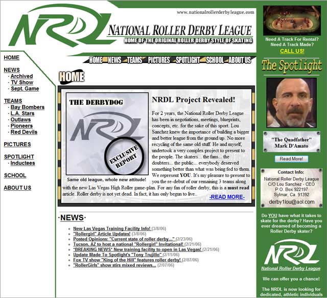
(above) The Official NRDL Website (2005-2010)
I'm proud to say that this website was revered by Derby fans and Derby athletes all across the NATION as THE site for the "original sport of roller derby." This was my most famous website. It was the content that really made this site as popular as it was, and it was considered a "credible reference" within the world of Roller Sports. I'm truly privileged to have had a hand in it.
|
"Dragons Den Pro Wrestling" Video Game Website
 |
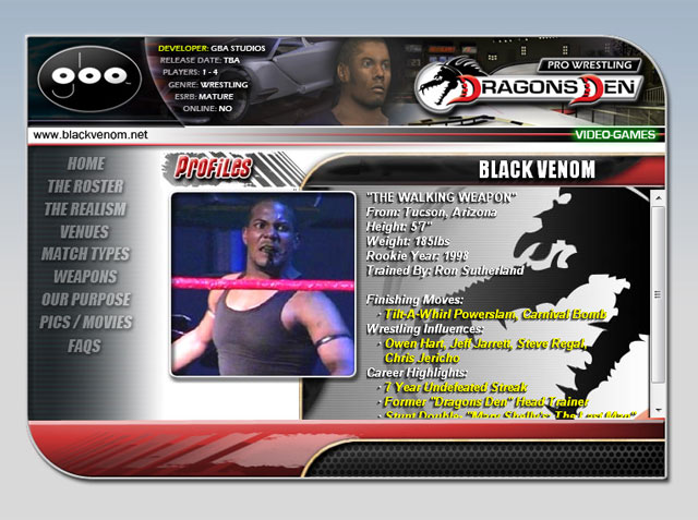
(above) The "Dragons Den" Website (2009), which was originally designed to be the second GBA Studios website.
|
"Eric Cabardo" Website
 |
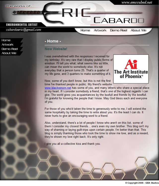
(above) The Official "Eric Cabardo" Website (2006-2007)
Boy, did I have fun with this one. I was given a unique challenge to come up with a quick and dirty website within a short length of time. This was the result, and it's one of my favorites. I created everything from scratch from the top logo with the sword (which was finished in a night), to the background composition. I was given free reign to do what I felt best with very few guidelines to follow. Once I inserted all of the work my friend had created, this website popped.
It became the envy of many other students graduating that quarter, and I've been told also that it's been the recipient of many compliments. I've actually been told by one that it looks better than my own, which in my opinion, is a wonderful compliment! It means I'm growing in terms of creativity, design and speed. It also means that I'm not one to hold back graphical elements because I feel it'll outshine my own works. I treat each project as if it was my very own. :) I told Eric, "Don't worry, I'll take care of you." After the product, he said "See, I knew I was in good hands."
Eric is a friend of mine from the Art Institute of Phoenix as well, and he specializes in video-game environments. He's a great guy to work with, with an excellent attitude to match.
|
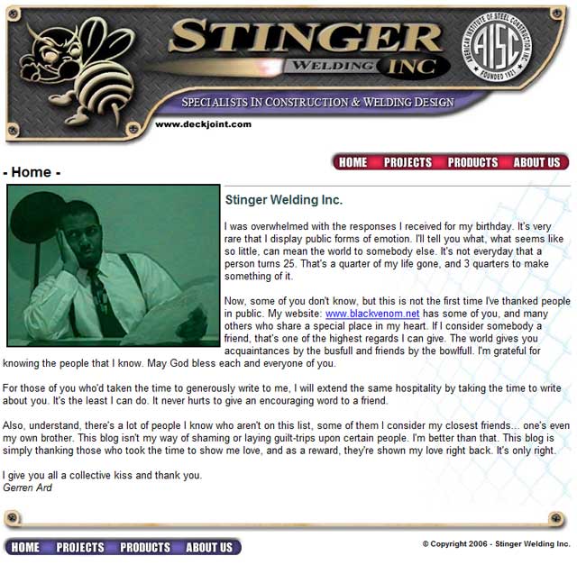
"Stinger Welding, INC." Website
 |
(above) Concept for the "Stinger Welding, INC." Website (2006)
Their original website was incomplete, and focused too much on "glitz and sparkles" that went nowhere. I constructed the website using the new logo I altered from their previous one.
Unfortunately, the website never left the ground floor. The company fell flat in the following years, and it took another 5 years for them to create a professional website.
In 2012, the owner, Carl Douglas, was killed in a plane crash.
|
|
|
Quick Fact:
Websites are expensive!!
The 'GBA Studio' website, for instance, is a multi-thousand dollar website:
• Logos,
• Buttons,
• Picture Altering,
• Art Compositions,
• Writing / Content,
• Animations and Movies,
• 3D Design,
• Coding,
• Pages,
• Etc.
This website had 150+ man-hours and planning behind it.
Now, throw in a rate that matches my level of education.
This stuff aint cheap!!!
Quick Fact:
Fastest website I've ever made?
The "Eric Cabardo" website was designed from scratch to finish in under 3 days.
The retail price would've been around $700 in 2006!
|


