
Online Advertisements
Disclaimer: "All Rights and Properties (Logos, Art/Photography, Offers and Information) belong to their respected owners. All ad-work/artwork 2D & 3D (with the exception of websites used as reference for building ads for clients) was created entirely by Gerren Ard."
I cannot take credit for the reference designs on many of the ads I'm showing, and I'm sure they wont mind the free advertising. Allow me to show you what I used to do for this ad company in particular...
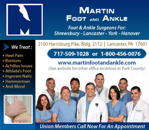
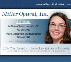
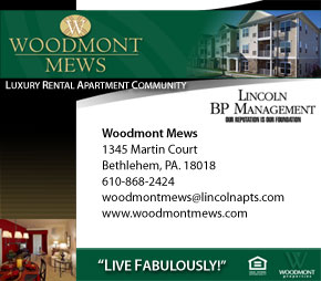
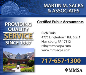
Lets say I'm part of a union. I find out that a website creates ads for unions specifically. I pay this website "X-amount" of dollars to make an ad for me.
Now YOU, as the graphic designer of this union website, will go to my website, and create a small ad from it. No cheating, no Photoshop files with layers already made for you. What you see is all you can work with, and you have to input your own text if they didn't do it for you.
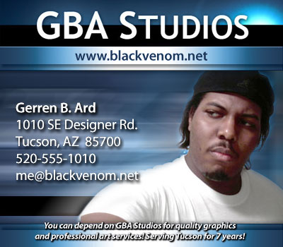
For example, using my own website, GBA Studios, create a small ad from it.
It may look like this:
 |
(above) Ad made in 20 mins, start to finish.
|
This is what I used to do for a job, and it rarely went smooth. I had to make ads based on a client's website. It may sound easy, but sometimes it isn't... especially when you deal with clients who have an idea in their head of what the ad should look like, but they can't "paint it" for you. They're not artists... and we understand that. It'll then be up to us to help them "paint their canvas."
So what happens if they don't have a website?
Great Question. Before I worked for them, anyone who didn't have a website got the "default template" pictured here:
 |
(above) Original "Default Template."
|
Whewww, I don't mind saying this is "uglier than a mud-fence."
This was obviously not done by a true graphic designer.
Definitely not worth the price they were asking for, either.
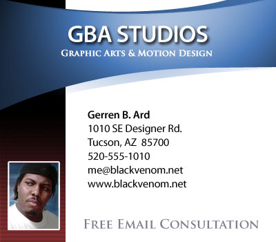
After I worked there for a while, and they liked my graphics, they asked me to produce a better template. From then on, the default templates looked like this pictured here:
 |
(above) Re-designed "Default Template." 5-minute edits.
|
Real graphic designers could truly run with this new design, and manipulate it enough to look different each time. There are many ads (right), that utilize this basic design to create several works of art. I tried to spice up these ads as best as I could to make them unique for the client. That's the true mark of someone who cares.
 |
Side Note -
I often say, I create everything as if it's being made specifically for myself.
EVERYTHING.
From a web-page to a ham sandwich...
Also, would you believe me if I told you that every single ad you just saw, cost the same amount of money... Even that awful orange one!? Now ask yourself, who wins and who loses in that deal?
Regardless, when this company was referred to me, they were 2 weeks behind schedule. Their main graphic artist left them, and the other graphic artists could not keep up with the demand. When I came on, they were desperate to get caught up.
"There's over 100 ads."
"When do you need them done?"
"AS SOON AS POSSIBLE!"
It was THURSDAY.
"I'll have them done, hopefully by Monday."
"Gerren... if you can do these ads by MONDAY...
You're the F'n Man! I mean, really... you'll be a life-saver."
He requested around 10 ads per day from the artists, so, I guess he really would've been amazed.
I went straight to work, alright...
**RECORD** 102 Ads in 4 Days.
And believe it of not, the company is no longer in business.
|
Know Your Specialists!
More than 900 ads have been produced by my hands, and for the most part, they've gotten the desired results. Through experience, I've found that business owners that try to take over the graphical design aspects of their business, do poorly in marketing their own brand.
I actually fought a restaurant that refused to put FOOD on their own advertisement!
A "Graphic Artist" will do what you want them to do. Few questions asked.
A "Graphic Designer" will tell you what you NEED to do, and then do it.
(And yes... there ARE two different pay rates.)
Printed Advertisements
I've also created advertisements for print:
 |
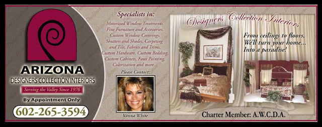
(above) Arizona Designers Collection Interiors
I didn't design this layout from scratch. I was actually given a paper flyer to work off of. I had no copy of the flyer on disc so I created everything from scratch, but the design was not truly mine. Also, PLEASE DO NOT call this number expecting to talk to Vanna White! She was just a place holder. But, if you want to do business with them, that's all fine. I don't mind giving the free advertising. They were pretty nice people to work with.
|
 |
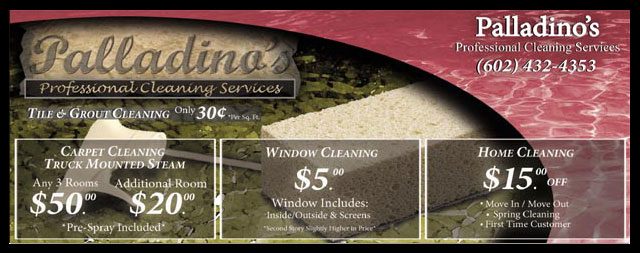
(above) Palladino's
Palladinos? I had no problem at all getting an approval from them. In fact, I don't think they really had no idea what they were in for. All they specified was that they wanted a red and yellow color scheme. This was all I had to work off of. The rest was purely my own imagination. Even the logo was my own design. I really wished Palladinos was the name of a pizza kitchen because the logo had that sort of feel to me... Honestly, I think it came out nicer than what they even anticipated, so I'm completely happy.
|
 |
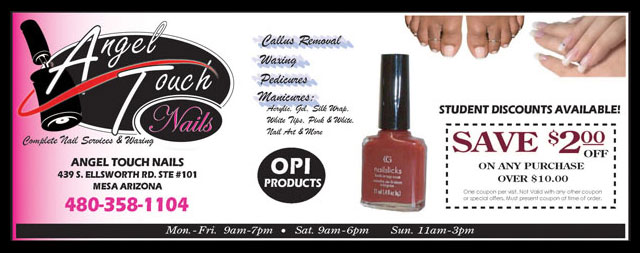
(above) Angel Touch Nails is an interesting situation.
It's one of my favorite ads simply because I designed their logo from scratch, and it's probably one of the most professional looking logos I've ever done. This company had no logo to call their own anyways, so I was really looking to push this design on them.
I told the sales representative that when she meets with the Angel Touch folks, DO NOT let them keep this picture of the logo. Let them see it... but DON'T let them keep it... for obvious reasons, of course. She nods her head and says "What? Do you think I'm THAT stupid??"
Well, when I asked for the paper back, she didn't have it. Take a wild guess as to why. To this day, I have no clue if Angel Touch Nails is using this logo at all. This is what I get for dealing with a middle-man that has no business-sense... or common-sense for that matter... whatsoever. This was guaranteed money in the bank that was totally lost.
Oh, how I kick myself...
|
 |
(above) Shangri-La was one of the first assignments I got working as a graphic designer.
I finally got an opportunity to show off a little bit of my graphics talent and blend it with marketing. This is a tough skill, to sell info about your product and to make it visually appealing all at the same time. Shangri-La was in need of a makeover.
The previous graphic design for their ad was "bland" according to Shangri-La, so I was asked to "pep" it up a bit. The finished product you see here was the result of many different versions. Unfortunately, their direction for the ad and my direction for the ad were totally different. This is what they wanted, and you just have to shrug and give it to them.
Looking at the ad itself... without reading a thing... there is little or no way, in my opinion, to tell that Shangri-La is actually a Chinese restaurant. There's no food anywhere in the picture. I wanted the idea of them selling food to be apparent in the ad, however, the owner insisted on having their front door as the main focus point (which I delivered... but the big golden door was just unappealing), and then finally we had them settle on their front walk-in area.
They were a difficult company to deal with. I gave my photographer specific pictures I needed, and the owner of the company had his own pictures he wanted taken in mind. And of course, they wanted constant changes made as if they were they only company we had to deal with. The ad came out nice anyways... but it could've sold much better if they had just taken my advice and left the designing to the artist.
|
Film & Book Advertisements
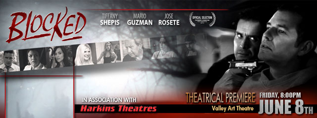
Here are some recent ads I've created for films:
 |
(above) "Blocked" 2012 Theatrical Release Advertisement"
|
 |
(above) Online Advertisement Graphic
|
The Power of Advertisements
When you look at advertisements, most people don't think much about what goes into them.
It's one of the most undervalued skills when it's done properly, and one of the first things you'll notice when it's done horribly. How many of us have said, "That commercial gave me a craving for pizza..." or how many have watched "Headlines" on Jay Leno to laugh at mistakes, misspellings, and poor ad placement?
Advertising is a very effective skill for an artist. If you find one that does it exceptionally well, make sure you treat them right, and LISTEN to their suggestions!! I've seen good products go up in flames because of poor advertising... and I've seen the strangest products sell millions through great marketing!
|
|


|


