

Synopsis
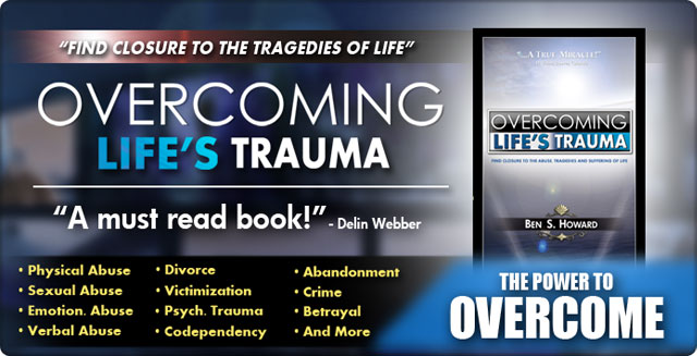
Inspired By Actual Events InvolvementI was booked to fly to Utah in the summer of 2011 to work as the graphic artist on a project that stemmed from tragedy. The project would be known as "Overcoming Life's Trauma," which was designed to be a self-help book, audio-book, and 3-hour long documentary workshop.I created the branding for the Author, the logo for the Corporation, the "Overcoming Life's Trauma" brand logo (and its derivations), a mock-up of a professional website to contain all of the content, the Cover-art for the Book (and eventual DVD), advertising art, and a majority of the motion graphics found within the 3-Hour Documentary. The 3-hour documentary was created by only 2 men in post-production... I and James Arnett. This movie used green-screen for over 80% of the film. This was one of the most grueling schedules I've encountered, and came on the heels of the film "Blocked" which we just finished post-production for a few months earlier. 15-hour work days were common, and we would often "tag-team" the movie in shifts with me working through the night, and James working through the day. In a little over 2 months, an entire film that would've taken a movie crew a million dollars to make and a year to produce was practically finished!
Movie AnimationsI think one of the "proving grounds" that tested my skills the most was having to take examples that were written in the book, and translate it into animation that made sense to the audience. It's not as easy as one might think. In fact, it requires a skill-set much different than just illustrating a book, and more complex than creating a simple Powerpoint presentation.For example, when animating the heart (e), it became "scarred" during the story. It lost color, lost its shine, and had marks all over it. In the book, the "scarred heart" was symbolized by 2 black and white pictures, one with less "x's" than the other... which as one would suspect, was not as interesting. We had to take something that could be read as "bland" or "dull," and "spice it up" to make it interesting for movie viewers. That's what a good graphic designer does. The direction of the film itself was a great concept by James Arnett. The journey began in a rocky landscape and followed the speaker through a long journey to, eventually, the mountain-top.
The FutureOverall, this project had a lot of potential and was pushed into a direction in which it was guaranteed to produce the desired results. This was some of the best graphic direction I've ever done, and I was highly satisfied with my work.It was very versatile... professional in appearance... and quite eye-catching. I believe, I proved once again that my skills can help carry ANY project to the next level. That's a reputation you can only earn from hard work. Only time will tell what will eventually come of this project. |
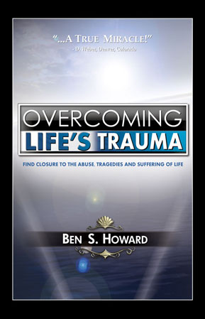
(a) Book Cover "ATTENTION: This is not a promotion for the author. The artwork associated with this project is solely created and owned by Gerren Ard, and all other images are the property
|
|||||


